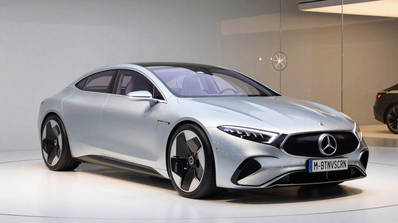
The cabin glows like a miniature cinema.
Across the dashboard of a brand-new Mercedes, three displays run from side to side, moving through menus and animations more smoothly than most laptops. The driver taps the glass, equally impressed and bewildered. The volume is in one place, the climate settings elsewhere, and the drive mode sits two swipes away. More gadget than machine designed to be driven, the car can feel.
Until recently, this pixel-filled dashboard was one of Mercedes’ proudest signatures. The celebrated Hyperscreen, touch-sensitive bars and high-gloss panels turned the car into a mobile technology showroom. Now, however, Mercedes’ software chief has made a statement that sounds almost rebellious: physical buttons may simply be more effective.
In a motor industry determined to imitate smartphones, that admission matters.
The point at which screens no longer felt clever
There was no dramatic scandal behind the change. Instead, it emerged through countless minor annoyances. One driver tries to alter the temperature on a rough road, only for their finger to slide across the display. Another has to open three menus to silence a lane-keeping warning. You may recognise the awkward pause when someone enters a new premium car and quietly asks, “How do you just… turn this off?”
Those polished displays appeared to represent progress on paper. In practice, drivers spend a few extra seconds looking away from the road. Their shoulders tighten. The vehicle seems intelligent, yet strangely inconsiderate. This is where the software chief’s change of heart starts: not in a laboratory, but in those fleeting human moments of annoyance and uncertainty.
A recent interview brought the issue into focus. Mercedes’ head of software said openly what many drivers had already been muttering: traditional buttons are often faster and safer to use. He referred to “muscle memory” and the ability to make adjustments without fixing your gaze on a screen. It may sound slightly old-fashioned, but it is also distinctly contemporary. In a world saturated with touchscreens, genuine luxury is making things effortless.
Consider the path Mercedes took. The company invested heavily, financially and emotionally, in the Hyperscreen: a curved sheet of glass extending from pillar to pillar. It was irresistible material for technology media, stunning in photographs and ideal for creating showroom impact. Sales staff enjoyed the way it made competing models seem outdated almost immediately. Owners took pleasure in showing it to friends. Online, the displays became viral talking points.
Then everyday use took over. Bright sunlight created reflections. Fingerprints covered the surfaces. Haptic “buttons” did not always register a gentle press. Older motorists asked dealerships why the heated-seat setting needed to be hidden in a menu in the first place. A German motoring club even assessed distraction levels and concluded that multi-layered screen systems could take longer to operate than straightforward physical switchgear.
Those findings reinforce a fundamental principle known to pilots and ergonomics specialists for decades: tactile controls allow the brain to perform two tasks at once. You can feel and drive. Screens require your eyes. They draw attention from moving vehicles, cyclists and children stepping off pavements. They may look uncluttered and futuristic, but they also introduce cognitive noise.
Why Mercedes is reversing its own touchscreen revolution
At Mercedes, the move is about more than appearance. It is strategic too. The company aims to develop its own software platform and reduce its dependence on Big Tech. Doing that requires it to design not only the code, but also the way people genuinely interact with it. This renewed appreciation for buttons is not nostalgia; it is interaction design connected to a steering wheel.
The software chief describes the approach as “smart reduction”. That means fewer gestures, more obvious menu structures and a greater number of functions assigned to proper knobs and buttons. You should be able to locate the volume control without looking. In an emergency, you should be able to hit the hazard warning button rather than search for it among a forest of icons. There is an irony here: as the vehicle becomes more digital beneath the surface, its controls may look increasingly analogue.
In practical terms, this amounts to a restrained revolution. Suppliers are once again being asked to provide durable buttons, rotary controls and clicky controllers. Designers are creating physical zones within expanses of glass. Mercedes is already presenting interiors with narrower displays, reduced visual clutter and more legible typefaces. The marque that transformed dashboards into tablets is now attempting to make them soothing again.
Every car manufacturer can take something from this. Screens that once set models apart are quickly becoming commodities. Any electric-vehicle start-up can attach a huge display to a dashboard. What is harder to replicate quickly is the sense that a vehicle “gets you” - that it assists rather than nags or confuses. That is the territory Mercedes hopes to win back.
How Mercedes buttons and screens affect driving, buying and complaints
For anyone currently choosing a car, this argument suddenly has real relevance. It is not merely about whether you enjoy large screens. It concerns how you will coexist with the vehicle each morning in traffic, in wet weather and while children are shouting behind you. Before discussing the price, sit in the car and carry out one straightforward exercise: change the three functions you use most often without having to think about it.
Lower the temperature. Switch radio station or playlist. Modify the driver-assistance setting or driving mode. Notice how long your eyes are off the road. Count the taps required. If, after a few days of ownership, you cannot complete those tasks by feel, the impressive interface is taking from your attention budget on every journey.
During a test drive, allow the salesperson to complete their polished presentation, then take over gently. Ask them to remain silent for five minutes. Use the controls as you instinctively would. Don’t be polite with the car. Turn, press and swipe at your own pace. If you require their assistance to locate basic functions, treat that as a warning sign. Strong design fades into habit; poor design makes you follow its logic, like an obstinate app.
We should be realistic: almost nobody reads the complete handbook or explores every submenu while parked on the drive. Let us be honest: nobody really does that every day. That is why these interface choices matter so much. You will learn the essentials within a week, but then rely on those habits for years. When Mercedes’ software chief commends physical buttons, he is effectively admitting: we went too far. We made cars for technology reviewers, rather than exhausted people at 7:30 a.m.
For the brand, the issue is also one of trust. Drivers are quietly rejecting “screen for screen’s sake”. Reports of lagging systems, crashes and frozen displays are no longer unusual. We have all heard a friend say that their car felt dated after just one software update. That is not the relationship Mercedes - or any premium marque - wants to have with customers.
The company is therefore changing its position. Rather than proclaiming “more pixels”, it is beginning to suggest “less friction”. Some models are regaining physical climate controls. Touch sliders on steering wheels are being exchanged for proper buttons. Software menus are being simplified, with important features kept readily accessible. The car begins to feel less like a smartphone that happens to contain seats, and more like a machine that respects your mental capacity.
Perhaps the most revealing aspect is not the hardware but the language being used. The software chief sounds like somebody who has heard complaints for years and has finally chosen to voice them. Such a “we went too far” moment is uncommon in an industry that is determined never to look backwards.
“Just because you can put something on a screen doesn’t mean you should,” admits one UX designer who has worked with several German car brands. “When you’re doing 130 km/h, the best interface is the one your hand finds automatically.”
That observation captures years of frustration in a single sentence. It also signals a wider movement extending beyond Mercedes. Regulators are paying closer attention to in-car distraction. Some safety organisations already criticise vehicles that conceal essential functions behind layered menus. Insurance analysts discreetly monitor the impact of technology-heavy cabins on driver behaviour and collision statistics.
- Look for cars that retain physical controls for climate settings, volume and vital safety systems.
- Try every touch control on an uneven road, rather than only while parked.
- Ask how long software updates will be supported and whether essential functions still work if the screen develops a fault.
The understated revolt against “all-screen everything”
A modest rebellion is under way, beginning where your fingers naturally land. Drivers are reaching the limit of endless tapping and swiping. Marques that built their reputations on precision and engineering are remembering that a properly weighted dial can be more impressive than a massive field of icons. On a night-time drive, illuminated by only a few crisp buttons, a car can suddenly seem like a companion again rather than a dashboard crammed with apps.
That does not mean screens will vanish from Mercedes interiors. Quite the opposite. Navigation, camera systems and advanced driver aids all depend on a capable display. The adjustment is more nuanced. It is about recognising the divide between what belongs on a phone and what belongs in a moving object weighing almost two tonnes. It is about accepting that “wow” must never come at the expense of “where’s my attention right now?”
At a human level, this is a story about adaptation as well. We have become accustomed to smartphones, smart televisions and smartwatches. A car, however, is not the same. It requires you to share responsibility with a machine in fast-moving, unpredictable circumstances. That is why the argument over buttons and screens resonates far beyond enthusiast circles. At its heart, it concerns the kind of technology we want in the areas of life where errors have consequences.
The next time you get behind the wheel of a new Mercedes - or any contemporary car - pause before pressing the start button. Look around the cabin. Notice what is glass, what is metal and what physically moves when you touch it. Then picture yourself in a hurry, in the rain, running late, with loud music playing and a phone vibrating in your pocket.
That is when the software chief’s admission becomes meaningful. It is when you find out whether your car is working with you, or quietly demanding too much from you.
| Key point | Detail | Why it matters to the reader |
|---|---|---|
| Buttons versus screens | Mercedes acknowledges that physical controls remain quicker and less distracting. | Better understand why some dashboards become tiring in everyday use. |
| Real driving experience | “Muscle memory” enables drivers to adjust functions without taking their eyes off the road. | Choose a car that is calmer to drive, particularly on longer journeys. |
| Mercedes strategy | A gradual return to straightforward tactile controls integrated into an in-house software ecosystem. | Anticipate the marque’s forthcoming interiors and changes across the market. |



Comments
No comments yet. Be the first to comment!
Leave a Comment